Improving e-Commerce Conversion Rates
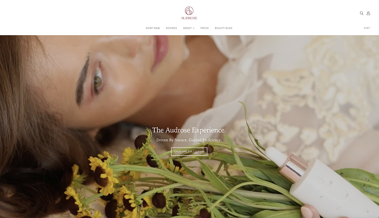
The prior images adopted a floral, "girly" aesthetic — soft pastel backgrounds, delicate flower/plant props, dreamy diffused lighting, and overly feminine compositions that felt more aligned with indulence-focused beauty brands than Audrose's core identity: Phyto-Molecular Skin Science®, and targeted solutions for sensitive/post-treatment skin.
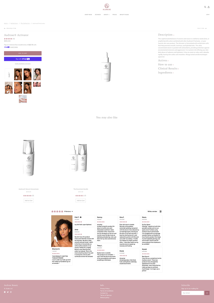
Core Misalignment: The existing product detail page photography on the site undermined the brand's scientific positioning and negatively impacted user trust.
Core Misalignment: The existing product detail page photography on AudroseBeauty.com undermined the brand's scientific positioning and eroded user trust in a high-performance, clinically-rooted product line.
This created clear barriers:
- Brand disconnect- Whimsical florals made precise, engineered products appear decorative rather than clinically effective, weakening perceived credibility.
- Audience mismatch- Sensitive-skin users seeking scientific reassurance encountered spa-like visuals instead of trustworthy, results-oriented cues.
- Conversion friction- Users lingered on images but bounced before purchase; analytics showed hesitation tied to lack of confidence in the brand’s serious claims.
- Accessibility gaps- Low-contrast decorative elements reduced clarity and failed to represent diverse skin types inclusively.
In short: The floral/girly style directly contradicted Audrose’s mission of evidence-based, high-performance skincare, softening the scientific edge needed to convert discerning buyers.
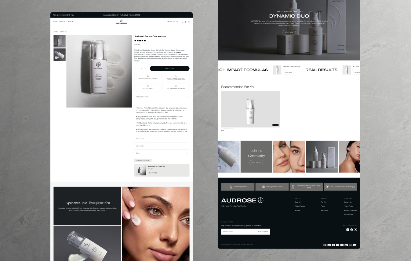
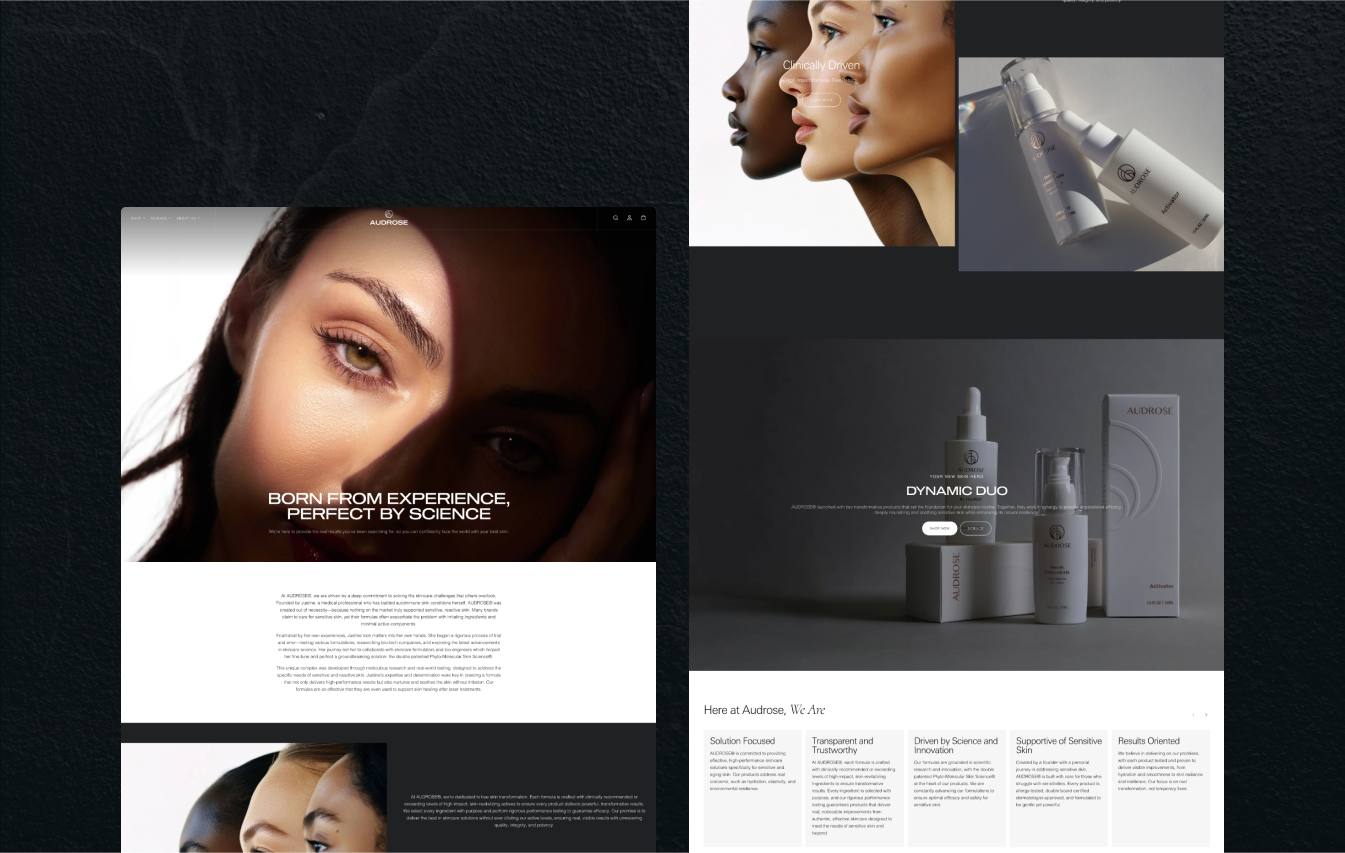
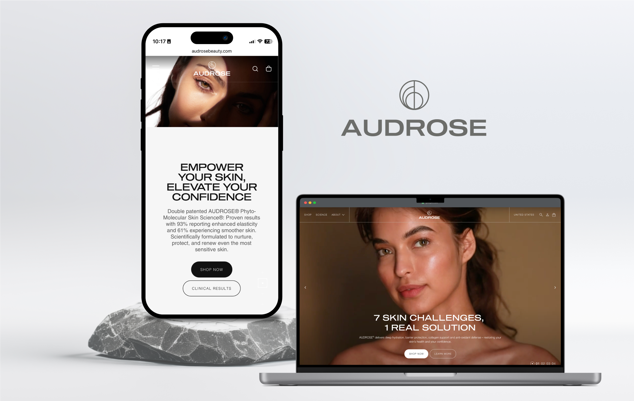
Strategic Overhaul: I led a complete photography refresh to pivot from floral/"girly" softness to a clean, scientific, calculated aesthetic — making the visuals feel precise, trustworthy, and aligned with Audrose's Phyto-Molecular Skin Science® identity.
Key moves as UX lead (collaborating with brand and photographer):
- Created breathing room- Eliminated excessive decorative florals, props, and busy elements; introduced ample negative space, minimalist neutral backgrounds (clean whites/grays), and open compositions so products could "breathe" and command attention without distraction.
- Shifted to stark, serious lighting- Replaced dreamy diffused/soft pastels with crisper, higher-contrast setups: directional key lights for defined shadows, subtle rim lighting for precision edges, and clinical-grade clarity to highlight textures, viscosities, absorption, and subtle results glow — evoking lab-like rigor over spa indulgence.
- Built results-oriented storytelling- New sequence: stark hero product shot (clean isolation) → macro texture/application details → subtle post-use skin glow/close-up. This visually reinforced clinical claims (e.g., barrier repair, hydration efficacy) and answered user doubts about gentleness + performance.
- Ensured inclusivity & accessibility- Featured diverse skin tones/types in natural, confident shots; optimized for high contrast, descriptive alt text, and mobile cropping to support all users
- Validated impact- Pre/post A/B testing + analytics review confirmed a +1.68% uplift in conversion rates.
Outcome:
The "breathable" + stark-serious visuals strengthened brand credibility, reduced hesitation for sensitive-skin buyers, and drove measurable PDP improvements.