OnWater
Took a product from 1 → 2 →3. Crafting a digital map and tools to help users discover and explore fishing locations.
Increase of Daily Active Users YoY.
Increase of Conversions from Free Users to Paid Users
OnWater is a GPS navigation app focused on helping anglers document and plan their time on the water with powerful planning tools. I was hired to improve the app and make the tools easy for users.
Lead UX/UI Designer
User Researcher
Marketing Designer
Developers
GIS-Data Engineers
Marketing & Product
Aside from the UI of the app feeling outdated, the issues can be summarized in the following 3 points.
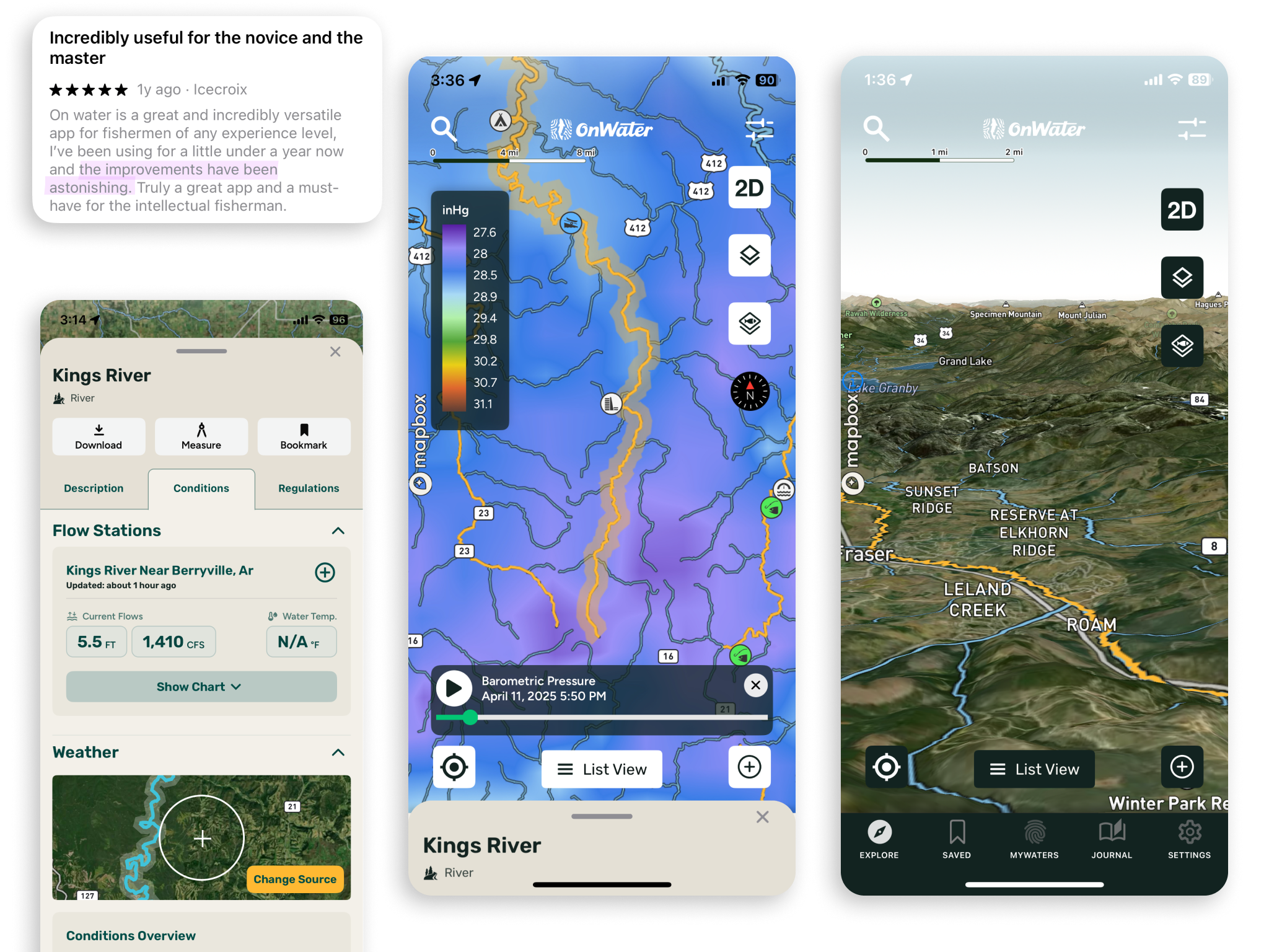
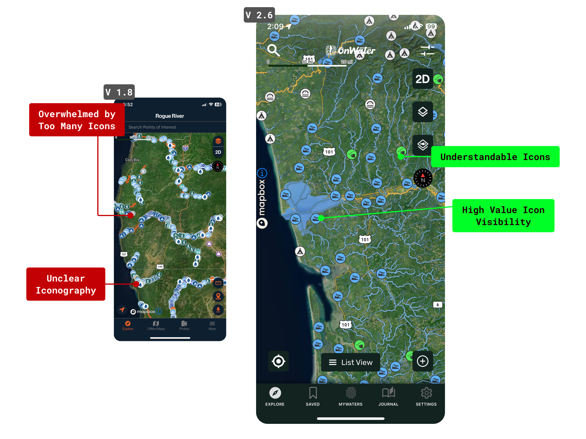
Maps were hard for users to read.
App navigation was not intuitive, we had a first impression major dropoff issue.
Information was not clear enough on how to take action for inexperienced anglers.
Coming onto this project as the first desginer, everyone wanted me to themselves. Everything was important - if everything is important, nothing is.
I had to focus on impact:effort.
The teams I supported estimated impact vs. design effort/time for our road-map.
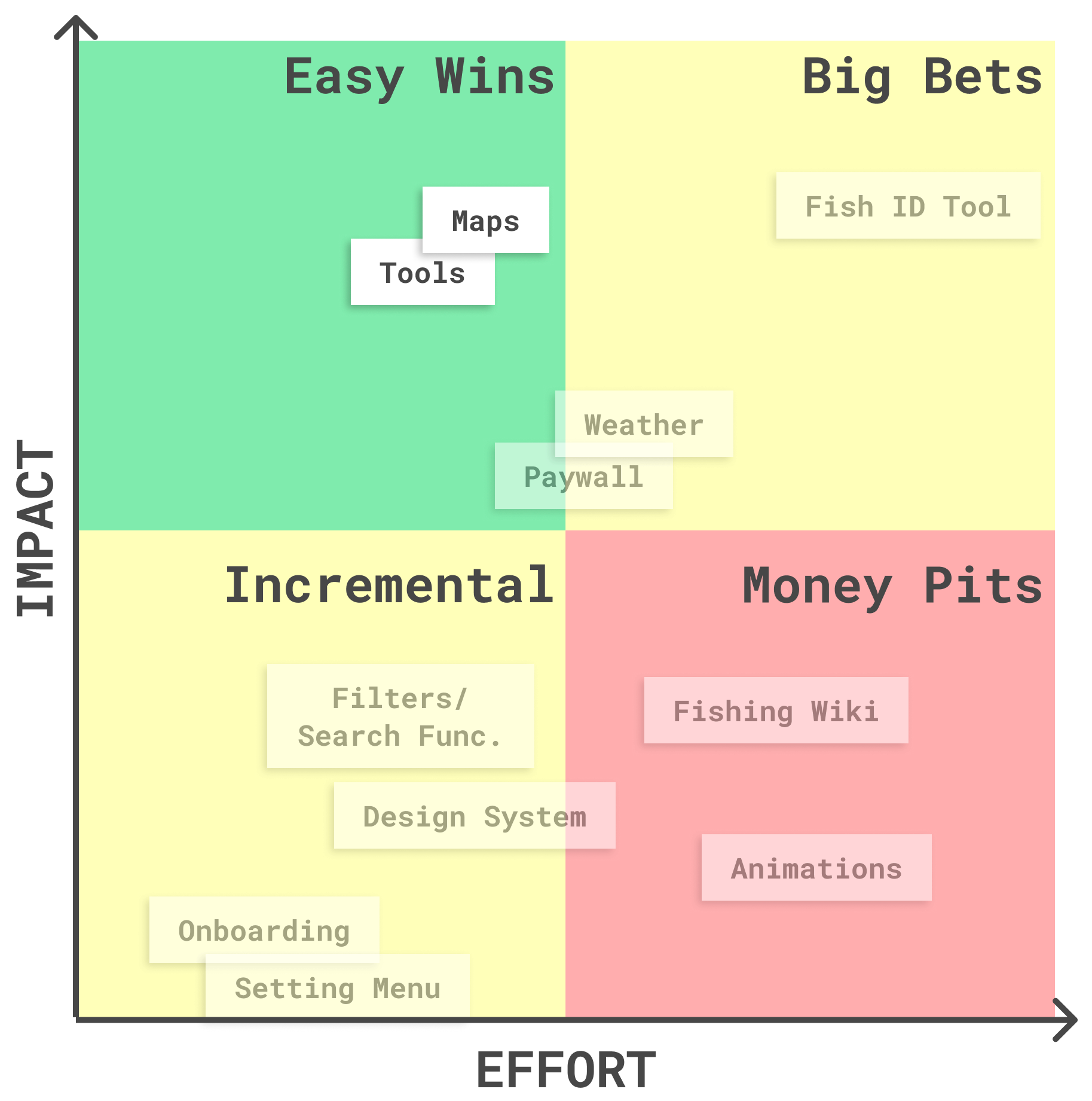
As a designer, I strongly advocated that fixing our tool UX was more impactful than revamping our entire UI Design System.
As we incrementally, and intentionally, worked through the Maps and Tools, the structure of the Design System began to form.
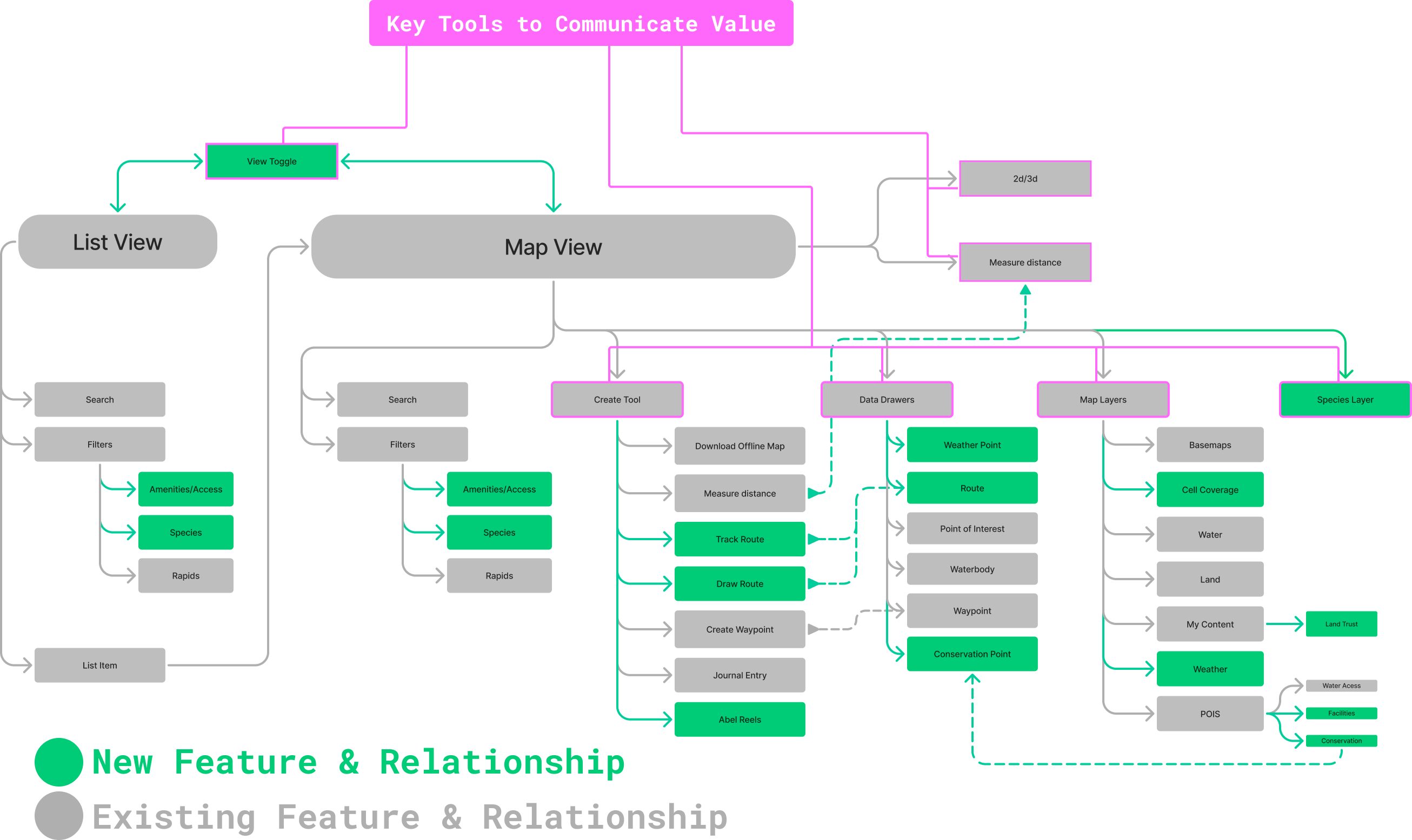
In order to take stock of what I was working with, I evaluated what existed via an app map to be used as a visual conversational tool with stakeholders.
Once I equipped myself with an easy-to-follow app map and the event trigger data we had on Amplitude, I was able to speak to the key tools that I saw our users found valuable and plan out our desired tool and feature-set.
To address our Map issues, I set out to improve our Points of Interest, beginning with actual iconography.
In addition to the actual icons, we followed a design principle of contextual disclosure:
Preventing clutter by displaying the right icons at the right time.
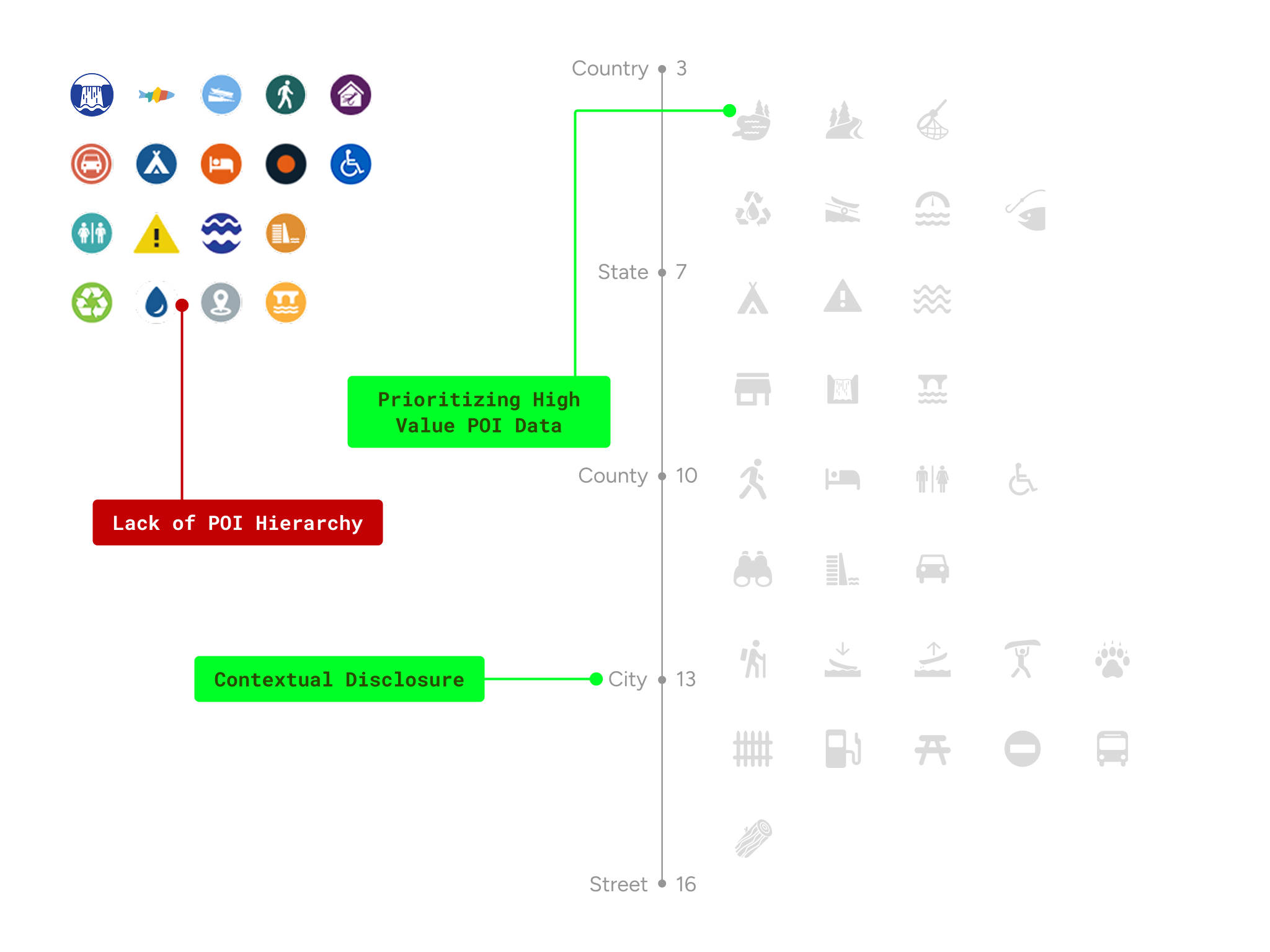
POI Iconography Contextual Map
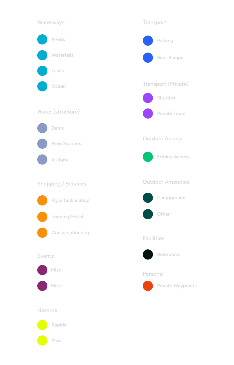
Once we established hierarchy of visibility across zoom levels and Icon Styling. The next consideration was color differentiation for users to quickly recognize the type of POI.
The App Navigation was addressed alongside the On-Map tool feature set.
Inspired by Googles FAB -Floating Action Button, I needed a unique menu to allow for the user to find their "create" menu.
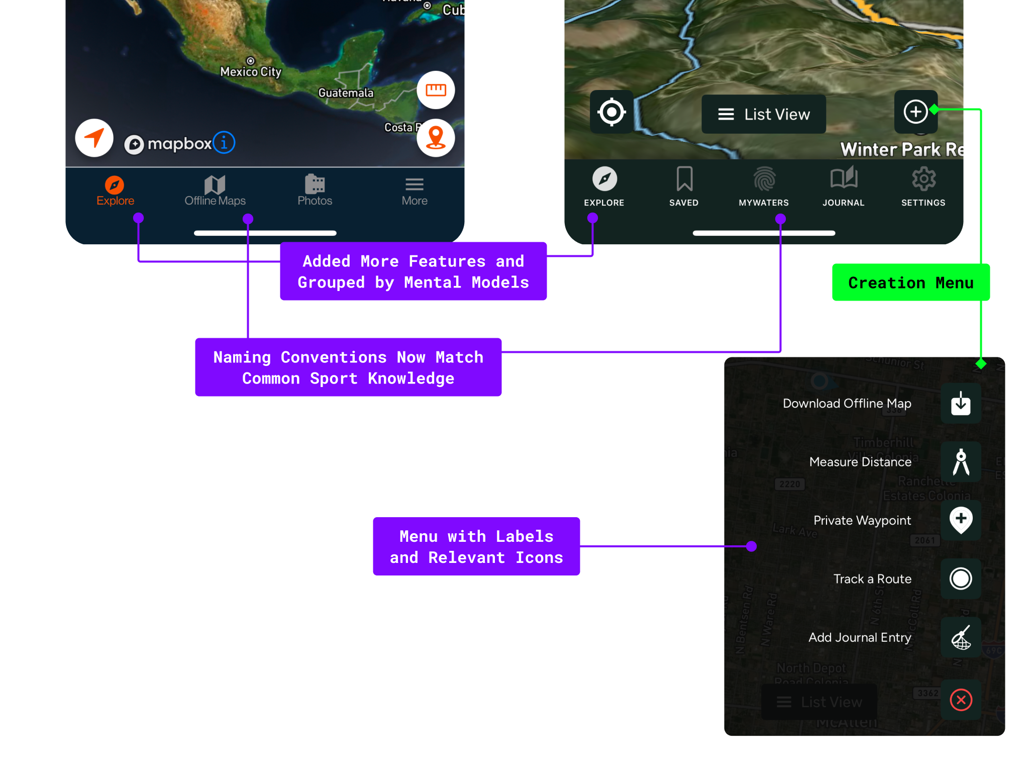
Our App Navigation, Heads-Up-Display with map tools and action buttons Redesigned to have a sleek UI and color pallete.
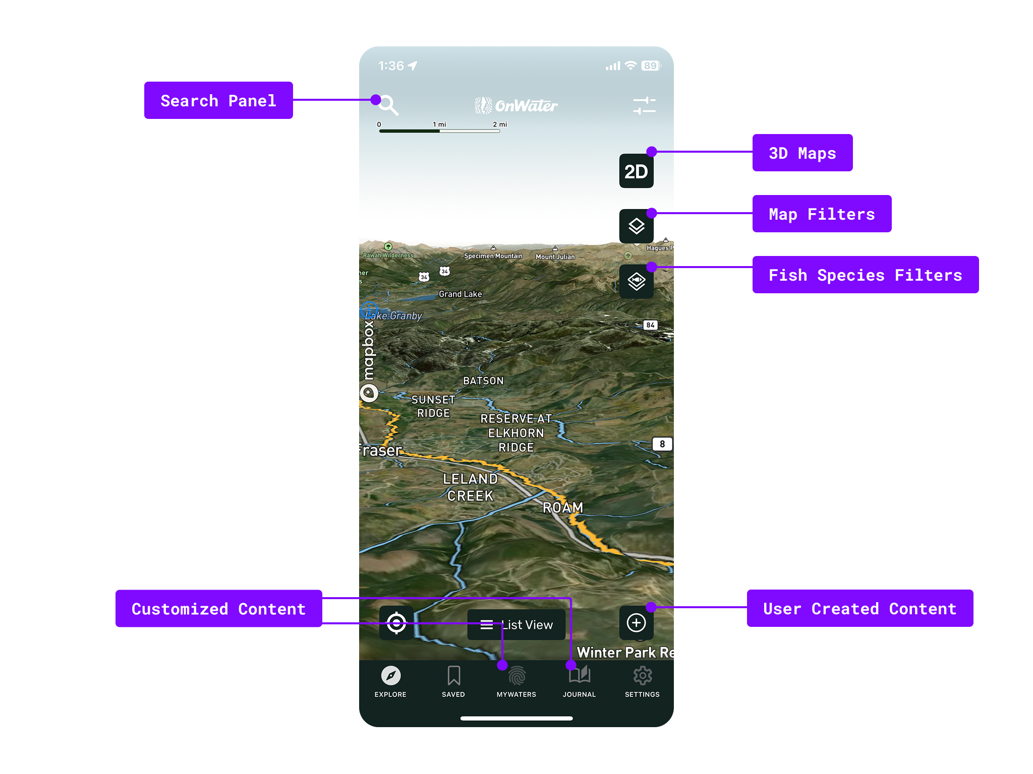
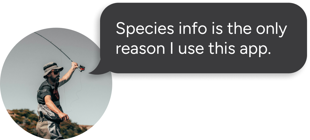
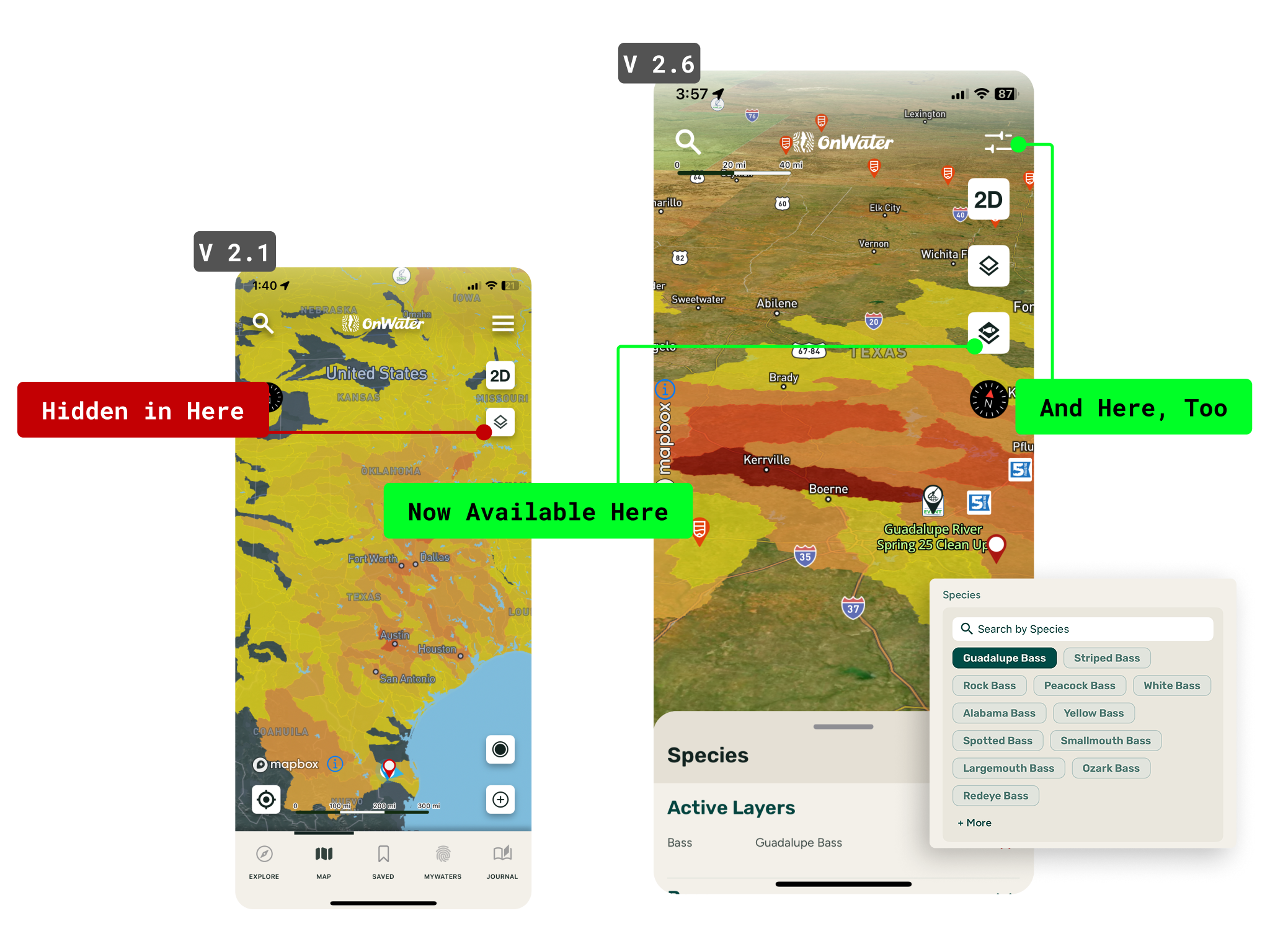
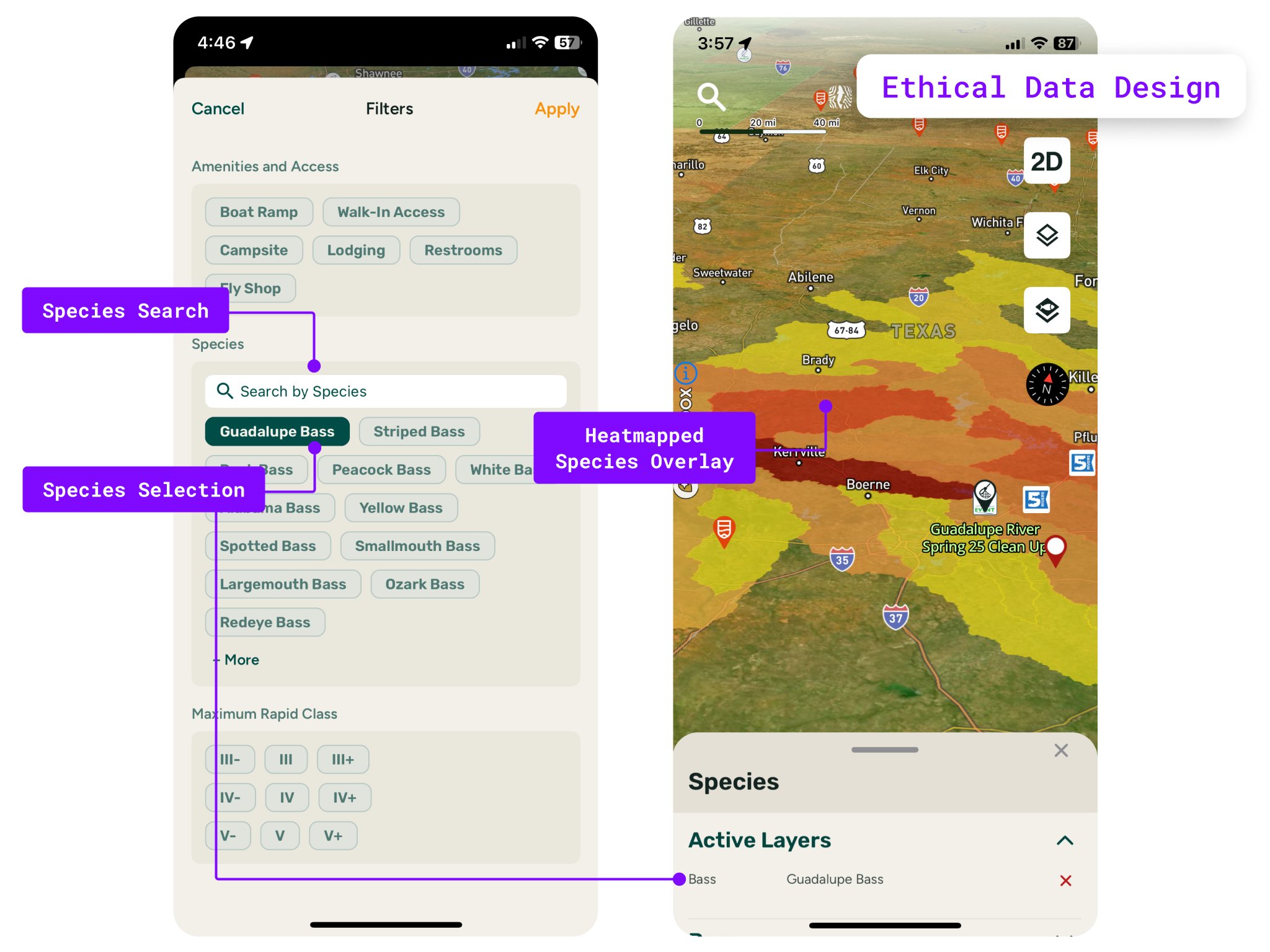
The Fish Species Layer was unique to our app as most navigation apps allows you to change the color of BaseMaps, toggle POIs etc.
DAU growth in 3 months.
DAU in 12 months.
Increase in Free to Paid conversions, 1.2% → 6%
Decrease in bounce rate for first-time users opening the map.